
This week: Using Light
(Click on small images to see them big.)
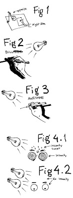
I think the title image says all there is to be said about tracing, right? Does anyone not know how to trace with light? You take a sheet of paper with a drawing on it, stick it behind a piece of paper you'd like that drawing to be on, shine a light through the back and draw on the top sheet. You can use a light box, a computer screen set to maximum brightness with a pure white screen, or a window on a sunny day. We're all good on that use? Then let's move on to studio lighting.
Some of what I'm about to say is really obvious once you know it, but unless it occurs to you or someone tells you, it can cause huge problems. Here's the most important thing: you want your drawing lamp, or whatever your lightsource is, to be OPPOSITE whatever side your drawing hand is, as seen below in Fig 1. If you don't have a light source you can move, then move your table. Fig 2 shows why this is so important: if the light is shining from behind your drawing hand, it will cast a dark shadow that will obscure your lines and make it very hard to see what you're doing. Fig 3 shows how placing the light opposite your dominant hand casts the shadow in back of your hand where you're not looking. You can even see the tip of your drawing tool! I'm gonna make an admission here and say that it was sophomore year of college before I learned this. By sheer chance I'd been placing my lamp correctly for years, but with my new school setup I'd gotten it wrong and it was giving me trouble. I think it was Jessica Abel who taught me how to place the lamp correctly, and bless her, I don't recall her cracking so much as a derisive smirk about it, as obvious as it must have seemed to her. She's a great teacher.
Now, some folks claim that a single incandescent bulb vibrates almost imperceptibly and causes eye strain. I've never had a problem with this, but if you feel yourself getting insane eyes (fig 4.1), I've heard it recommended that you either get two light bulbs to cancel each other's vibrations out, or buy a lamp that has both an incandescent and fluorescent bulb. I can't stand fluorescent lights at all, but it seems to help a lot of folks I know. The important thing for me is that the light be one of those daylight bulbs that cast a white light instead of a yellow light. That's what it takes to keep my eyes sane. (Fig 4.2)
Now, a couple of posts ago in my manifesto for this blog, I wrote about the kinds of tips about craft that can be taught quickly, learned instantly, and instantly improve anybody's work regardless of skill level. These little tips and tricks may not be physical tools, but they are mental tools that everyone needs in their mental toolbox to help them do what they do better, so I feel they belong on the comic tools blog. Here's some basic ones about light and shadow:
- Generally, thin lines facing the light source, thick lines facing away.
-Generally, when you don't have some strong light source contradicting this, shadows should go under things, on the undersides of things, and on things that are in back of other things. (Someone walking might have the back leg blacked in, for instance.)
-Trying to draw a cast shadow by tracing the outline of the object and then using that to make the shadow looks like shit 99.999% of the time, and I can always tell. I know it seems like a shortcut, but so is having your hair cut by a lawnmower.
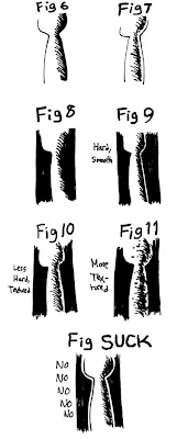
-Fig 6 and Fig 7 show two ways of drawing shading on an object with a light source to the left of it. Neither of them is better than the other, but you have to know when to use them and why. Fig 6 shows hatching blending from the light side to the dark side, which is totally black. Fig 7 shows the hatching going from the light to the dark side, but it also shows the reflected light on the edge. If you look closely at the edge of an object with a strong light cast on one side, you'll see that the darkest part of the shadow isn't actually on the opposite side, as you might logically expect, but rather it's just before the edge. The edge is slightly lighter. That's because to your eye, the abrupt cast shadow contrasts strongly next to the light side, but once you're looking at the shadow side the light already in the environment, however dim, lights that dark side ever so slightly. That edge of muted light can really save your ass when you have to draw something against a black background. Fig 8 shows regular black shading with no reflected light, and as you can see, everything shaded disappears. The entire right side disappears, and the shape is impossible to discern. Fig SUCK shows a common, shitty solution to this problem, which is to draw a white space around everything you draw against a black background. I don't give a shit HOW many professional, published comics you see doing this. A lazy, shitty shortcut that pros use is still a lazy, shitty shortcut. It takes a few second's extra thinking to do it right and if your comics don't mean enough to you to do that, please throw your pages down a well and break your fingers with a hammer. Fig 9 shows the simplest solution to the problem, which is to represent the reflected light by stopping your shading just INSIDE the outline on the shaded side. This works especially well for people who don't hatch, actually- it's clean and smooth and graphically useful, allowing you to distinguish flat shapes from a background with no modeling. If you do hatch, though, it looks a little too smooth for some materials. If you need to soften it, you certainly can , as Fig 10 shows. In fact, if you want to start playing with the hatching itself, and maybe start interrupting the edge of the reflected light, you can really start getting some wild textures. I was going for some sort of pitted stone with Fig 10.
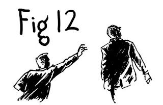
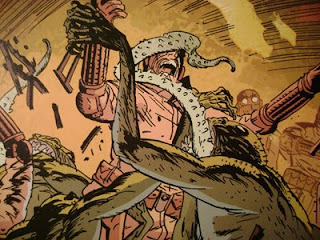
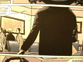
 Finally, a note about drawing black things: don't draw them entirely black. Black objects, even very. very black objects, always have some lighter bits and darker bits. Go look at your black pants, or your leather jacket, say. Drawing those shadows not only tells your reader alot about that material, it also makes it look MORE black, oddly. Filling in a black suit totally black is another shitty, lazy shortcut that pros use all the time and shouldn't. If your comic has really simple, graphic charaters, solid spotted black clothes might be acceptable (although I'd encourage you to design the simplest of characters with some highlights on their blacks, even if it's just some white on top of the shoulders) , but you'll still have to contend with putting those characters over a black background, or having a black-sleeved arm cross over a black chest. You'll probably need a white line of some kind then, and if you remember what I've just told you about lighting, that white line will look natural and unobtrusive, instead of making the reader go "Oh, wow, I guess that guy never planned for that character's arm to go over their chest, huh? EEsh."
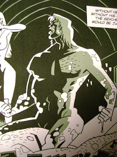
I'll conclude with a few selected panels from Gabriel and Guy Davis that embody the principles I've been talking about:
 Next week's tool: Pointed Sticks.