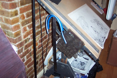
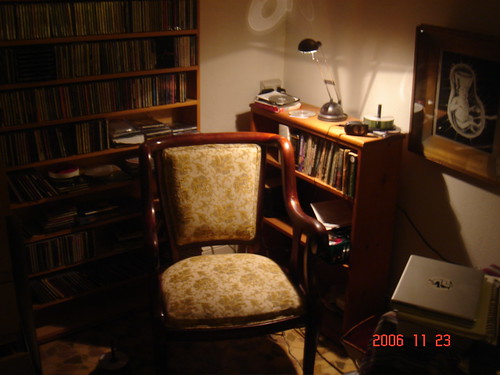
We're Huge in Jakarta!

Filsuf Jagoan!
Released November 2007 it's the Indonesian translation of Action Philosophers: Filsuf Jagoan! I think I like their cover design better than ours. Eventually all three volumes will see publication in Indonesian. There is also a Brazilian edition in the works, not sure of the release date. Could an Esperanto version be far behind?

It's coming! March 2008!


Ryan just handed this into Diamond.

Get excited... Get very, very excited...

(And click to enlarge.)

AP Vol. 3 TPB @ the printers!


Action Philosophers Giant-Size Thing Vol. 3 went to the printers this morning! Yay. This is later than we had hoped, but Ryan suffered a crippling computer crash that required us to redo a lot of the files. But we're back on track, and our final (inexpensive!) collection, this one of AP #7-9, should be hitting comics shops toward the end of November or early December, and will be available on this site not long thereafter. For those of you who absolutely can't wait, single issues of AP #9: the Lightning Round are still available, heh heh...

COMIC BOOK COMICS marches onward!


Now that AWESOME: The Indie Spinner Rack Anthology has premiered -- and special thanks to our pals Alex and Mary for hosting our launch party at Brooklyn's Rocketship and making it such a spectacular success -- Ryan and Fred can get to work to finishing the first issue of their follow-up project to AP, COMIC BOOK COMICS, the irreverent but definitive history of manga, comics and graphic novels in comic book form. (AWESOME, of course, finds the very first [albeit stand-alone] CBC installment...pick yours up at your local comic book store or the ISR gang themselves immediately if not sooner!)

We're happy to report that the boys are working hard, with Fred putting the final touches on the #2 script while Ryan is furiously finishing the art for #1 in time for the planned March '08 release date. And with the entire Van Lente and Dunlavey clans in the Washington, DC area to premiere AWESOME at this year's Small Press Expo, we made a field trip to the National Gallery of Art, where CBC subject Roy Lichtenstein donated much of his stuff. And art.
As you can see folks, Evil Twin Comics spares no expense researching our comedy non-fiction comics, as long as the research is personally convenient to us. The photo at right depicts ETC founder and resident pop artist Ryan Dunlavey (pictured with baby) with "Look Mickey", Lichtenstein's first piece of pop art.

Fill your life with AWESOME @ ROCKETSHIP Oct. 19!


AWESOME: The Indie Spinner Rack Anthology is on schedule to rock your world in comics stores everywhere October 17. This Friday, October 19 at 8:00pm, head on over to Rocketship, Brooklyn's premiere purveyor of funnybooks, for the official AWESOME book lunch party (directions and details at this link)! There will booze, dozens of the contributors (including ETC's Fred and Ryan), and we can almost guarantee that at least once, before the night is over, someone will take his shirt off. (We're looking at you, Charlito.)

You can also preview the book and get ordering information off the official AWESOME web site.

And remember -- AWESOME contains the first installment of the new ETC series, COMIC BOOK COMICS, which gives the AP treatment to the history of graphic novels, manga and comics!

AP #9: THE LIGHTNING ROUND goes on-sale 9/6!


We weren't sure about this until last night, when Fred appeared at NYC's live Comic Book Club (which was great fun, by the way -- thanks to Alex, Justin and Pete for having him to talk Super-Villain Team-Up), but at long last, the climactic issue of AP, #9: The Lightning Round hits comics stores this Thursday, September 6! (New comics come out on Thursday instead of Wednesday this week because of the Labor Day holiday.)
UPDATED! (x2) Our pals at Comic Book Resources did a great Action Philosophers Exit Interview with Fred and Ryan about this issue, with a preview of the issue too -- They posted the Fred interview here, and Ryan's pearls of wisdom can be found here!

UPDATED! (x3) We put this issue on sale here at the site starting now!

This book is AWESOME!


AWESOME: THE INDY SPINNER RACK ANTHOLOGY, that is. Evil Twin Comics is proud to be publishing this collection of new comics from some of the hottest indy creators around (as well as some select up-and-comers), co-edited by ETC founder Ryan Dunlavey and the hosts of the Indie Spinner Rack podcast, Charlito and Mr. Phil. All net profits for the book benefit the non-profit ISR 'cast and will go to help establishing a scholarship to Vermont's Center for Cartoon Studies. Best of all, it features the world-premiere of Fred and Ryan's follow-up to Action Philosophers: Comic Book Comics! It's two worthy causes and dozens of awesome comics creators wrapped up into one attractive 205-page package, premiering in October at finer comics shops everywhere and at this year's Small Press Expo! Preview the book for free at the official web site, or, better yet, show your support for ISR and CCS by pre-ordering the book NOW from our pals at the Discount Comic Book Service!

Visit AP @ San Diego Comic Con -- Sort of!


Well, Ryan and Fred did not get a table at SDCC like they were hoping, but Fred Van Lente will be heading out to North America's premiere geek showcase nonetheless. To promote his Jul. 18-debuting series Super-Villain Team-Up: MODOK's 11 he'll be signing at the MARVEL COMICS booth from noon to 1pm on Friday, July 27, so drop by, say hi, bring copies of ACTION PHILOSOPHERS for him to sign ... just promise not to throw stuff at him.
Lettering Day!

Lessons from two SVA alumni:

-Exaulted letterer Todd Klein has a website, with some lettering and design instruction. It covers hand and computer lettering, and even includes a lesson on balloon placement.

-If you didn't think Matt Bernier was insanely dedicated to lettering before, check out this incredible pen hack:


So, to explain what you're seeing a little better:

While sifting through the immense piles of junk left behind by my late grandmother, we occasionally come upon something worth keeping, and one such item was an old fountain pen that my grandfather got for his years of service at Central Maine Power.

As you can see in the picture titled "original configuration", it was a basic plastic fountain pen. The nib is enclosed on the bottom and top by plastic, which the ink creeps down through to supply the nib with ink. The piece securing the bottom of the nib is actually a tapered plug of plastic that fits inside the larger tube that makes up the front of the exterior body of the pen and which hoods over the top of the nib. The inner plug has ink channels which suck up ink into the pen when it is filled. Going further back into the pen, we find a needle thin plastic tube that regulates the flow of ink into the ink chamber created by the gap between the plastic plug and the outer shell. This is to prevent blotting. This tube sticks out of the front section of the pen and into the rubber baggie. The rubber baggie is where the ink goes. Like an organ, it is protected by the outer shell of the back of the pen. On the side of the outer shell is a lever which, when pulled down with your thumbnail, causes a metal foot to squish the little baggie against the side of the pen, squeezing out the ink inside. Releasing the lever allows the bag to re-expand, drawing ink into the pen. This is how filling, or, if you prefer, squirting of the pen is achieved.

Now, I do have specialty fountain pen ink. But  it's too thin to make good lines for reproduction, and I wanted to use the pen for lettering. So I put in india ink. It said it was suitable for technical pens, so I figured I'd be okay with clogging. BIG mistake. As I found out, and then later read on every website that discussed fountain pen care, the lacquer base in india ink will seize a pen permanently. But I was unfazed- I've saved brush pens that were clogged, so I figured that a fountain pen could not possibly be as big a challenge.

My first barrier to entry was the bagie, which was glued on. I had to remove it to access the inside of the pen. I carefully loosened it and slipped it off, leaving it to soak in hot water after rinsing it. Then I removed the little tube, using a needle to drive out the solidified ink blocking the way. Then I spent two hours cleaning out all the gunk that had filled the ink chamber. Now it was time to reassemble.

The glues in my house were not suitable to re-seal the baggie, and all my attempts leaked ink. I needed another plan. I was staring at the end, wondering how to stick this crumbly old rubber baggie back on, and then it hit me: the opening looked very close to the size of my brush pen ink cartridge. I thought it might just work, because of the special properties of brush pen ink. The Japanese were the first, and as far as I know, only to have developed waterproof india ink with such finely ground pigment that it won't clog a brush pen. I thought that perhaps it might work in a fountain pen. I grabbed a cartridge to see how they fit. The cartridge was too small. But cartridges taper to get wider at the back; what if I cut the back off and stuck it on that way? I looked like it would just work. Even though it meant losing a cartridge if it failed, I tried it anyway. (I left out the ink regulator, because india ink is thicker, and I'd actually found the pen a little too dry even with wetter ink.) I had to jam it on so the plastic whitened a bit, but it worked. It formed a perfect seal, it drew beautifully, and one week on and it hasn't clogged at all. Furthermore, it's easier to clean, and it refills with cartridges. And the lines are waterproof. The only downside is that I had to lop the back end off the pen to get the cartridge to fit, but an ugly stalk is a small price to pay for the best pimped out pen I've ever used.

-Matt Bernier


According to a NY Times article from a few weeks back, Tony Millionaire uses "store-bought fountain pens he tweaks with a pair of needle-nose pliers." Perhaps hacked fountain pens are the wave of the future?

And while talking to Matt, he gave me the best reason I've ever heard to get as good as you possibly can at lettering: As lettering usually makes up a good third of your page, if your handwriting or lettering sucks, your page sucks by at least 1/3 before you even draw anything. So letter good!

And to round out the day: Achewood on Comic Sans.

Visit AP @ the MoCCA Arts Festival & ALA!


It's a busy convention weekend for Ryan and Fred -- first up, come visit the ActPhilo booth at the MoCCA Art Festival Saturday June 23 and Sunday June 24 at New York City's Puck Building. The Evil Twins will have their usual array of comics, t-shirts, prints and bad humor available. (They will both have just attended a bachelor party the night before though, so if you could keep your voices down they'd appreciate it.)

Then on Monday, Fred will be hopping the train to Washington DC and this year's American Library Association convention. He'll be signing at the booth of our redoubtable book distributor, Biblio beginning at 12:30pm on Monday June 25, so if you're there, stop and by and say howdy!
Dave Kiersh


Basic Bio: I’m a librarian who tends to draw comics about “troubled youth”.
Comics: A Last Cry For Help
Website: www.davekcomics.com
Making comics since year of: 1997
Art education/schools attended: One year of art school was helpful.

Tools


I don’t use a pencil at all. Instead I do my rough drafts with the same pen that I’ll do the final version with. I trace over my roughs with the use of a light box. I find that I could never match the consistency from pencil to paper and that erasing is a nightmare. So I quit using pencils long ago. With the use of a light table, I can do multiple drafts with my Pigma brush pens and Pigma Microns 05 and 08. I simply use cheap Xerox paper because I end up doing lots of drafts. This works for me because I limit myself to 4 panels a page. If I wanted a page with more panels, I’d use a larger format. Also, copy paper is thin, which makes it more transparent. And I don’t have to worry about messing up and wasting it! I like the size too because it fits neatly on the scanner. For color I use Photoshop and draw with a wacom tablet. In referencing CMYK, I use a Color Index book for reference.

Tool timeline, starting from when you began drawing in any serious way until the present, and what spurred the changes: The use of a light table changed the way I worked. I started doing multiple drafts and in the process, my art developed into a cleaner style. Now I’m starting to draw directly into the computer using a wacom tablet. Using layers, it’s a very similar process.

What tools you'd never use, and why: A mechanical pencil. And Pen Nibs. Because the pencil is too predictable and the nibs are too unpredictable.

On the Road with ACTION PRESIDENTS!

That's right, kids, ACTION PRESIDENTS is in development, and the crack Evil Twin Comics team, in order to bring you the finest quality and most obnoxious non-fiction comedy possible are sparing no expense in traveling for research ... as long as said research is in (cough) driving distance from New York City. Our intrepid scribe FRED and his beautiful wife spent Memorial Day Weekend visiting three (count 'em) THREE Roosevelt-related sites and he'll you all about the hilarity that ensued in his travel blog on the ETC boards.
Pat Lewis


Comics: THE CLAWS COME OUT (due Nov. 2007 from IDW), various minicomics including "Thankless Job," "Hideous," "Abominable," "One Horse Town"
Website: www.lunchbreakcomics.com
Making comics since year of: 2002 maybe? It's hard to pinpoint exactly when I quit screwing around and got serious about it.
Art education/schools attended: No formal art training, but writing is an important part of making comics, too: I have a BA in English from Penn State.


Tools

Pencils: I sometimes do my penciling in a coffee shop, away from my studio, so anything that needs to be sharpened isn't a good option for me. Right now, I use a Koh-i-noor mechanical drafting pencil with Pentel .05 blue leads. The blue drops out when you adjust the threshold in Photoshop which is good because you don't need to erase your pencils that way. The bad part is that you CAN'T erase them very well, which can be a pain if you need to redraw a panel multiple times.

Pens: Micron 05 (or equivalent), Faber-Castell PITT artist (brush) pen, Uni-ball Micro for tiny details.

Paper: Canson 14" x 17" vellum-surfaced bristol, cut in half to make two 8 1/2" x 14" sheets (I draw my pages at 8" x 12"). Lots of people swear by Strathmore, but I like the Canson--it's a brighter white and has just enough "tooth" for my tastes.

Lettering: No one ever talks about Ames guides! I space my lines of text with an Ames guide, but I'm never too sure what to set the wheel at, so I use the fixed set of holes on the left-hand side. I do the finished lettering with a Micron 05, and a Penstix 0.7 mm drafting marker for bold text.

Color: Photoshop! I recently upgraded to CS for an illustration job, but I got along fine with version 5.0 and before that, the limited version that came free with my scanner.

Layout/ Composition: Nothing fancy--I make tiny (approx. 1" x 2") thumbnails in my sketchbook, on scratch paper, or wherever's handy. I find I spend too much time and energy on my layouts, it kills my desire to work on the actual page.

Tool timeline, starting from when you began drawing in any serious way until the present, and what spurred the changes: I went through a series of cheap felt-tip pens until I fell in love with the Fountain Pentel sometime in the 90's. It gave a nice variety of thin and thick(ish) lines that you don't normally get from most felt-tips. Eventually, they changed it from a cheap, disposable pen to a more expensive refillable model, which was okay except the refill cartridges were tough to find. So I switched to Microns, which are pretty ubiquitous and can still provide a good line variety if you know what you're doing.

What tools you'd never use, and why: I never say never, but I don't really have any interest in dipping a pen or brush into India ink ever again. The potential mess and the fear that I'm going to make a huge mistake really holds me back and keeps me from working as fast and spontaneous as I like.

And lastly, any advice you'd like to give: I enjoy reading about artists' tools as much as the next dude, but don't let anyone make you feel guilty for how you work. The results are all that matters, and odds are any shortcomings you may have are probably the result of your skill level rather than what kind of pen you use (at least, that's the case with me). No matter how weird or unorthodox your methods, I guarantee there's a professional artist out there doing great work with an even crazier way of working.

Own a piece of Philosophy history!

Action Philosophers artworkWell, Action Philosophers history. Close enough.

I am happy to announce that I am now selling my original artwork from ACTION PHILOSOPHERS on Comicspace.com! All art can be easily and immediately purchased with a credit card via Paypal. Most pages cost only 30 bucks (some even cost less), and shipping is totally FREE! I've already sold the entire "John Stuart Mill" story within an hour of posting it for sale- so the rest of these pages could go fast.

Thanks for your attention,
Ryan D

Click here to view my original art sales gallery.
Kevin Colden


In the time since Kevin sent this to me, he's started serializing his new comic, Fishtown, on ACT-I-VATE, and won a Xeric Grant to publish it, which he then turned down to continue serializing the comic online. Appologies on taking so long, Kevin!
-MK


Comics: Todt Hill (at The Chemistry Set), House of Twelve, MAULED! and others.
Website: www.kevincolden.com.
www.chemsetcomics.com
Making comics since year of: 2002
Art education/schools attended: Joe Kubert School (Class of 2001)

Tools

Pencils: Koh-I-Noor Rapidiomatic 0.5mm 5635 (with blue lead) and Col-erase Blue #2044 (I have a huge stockpile of these)

Inks: Speedball Super Black India 3338 for brush work; Higgins Black India 4418 for dip pens

Brushes: Raphael Kolinsky 8404 #3 (also #1 on my smaller size pages); for effects I'll also use a stiff bristle acrylic brush or a toothbrush.

Pens: Maru G-Pen (for large lines), Hunt 102 (for details), and Hunt 107 in metal nib holders (the plastic ones suck); Koh-I-Noor Rapidograph .70 for panel borders; Staedtler Mars Professional .35, .5 and .7 tech pens for ruled lines.

Paper: 11 x 17 smooth pre-ruled comic boards from EON Productions; also 9 x 12 smooth pad for smaller pages.

Lettering: Illustrator CS2 with either my own font or CC Wildwords.

Color: Photoshop CS2 on my trusty Mac Mini G4 with a Wacom Intuos 2 Graphics tablet; scanners are a Mustek A3 USB and 8.5 x 14 Canoscan N122OU.

Layout/ Composition: 9 x 12 tracing paper with a regular soft #2 Ticonderoga pencil, then blow the roughs up to size if needed on a Xerox machine or computer.

Convention Sketches (when different from illustrations done in the studio): Kaimei brush pen and Staedtler Microns of various sizes.

Additional stuff: 14 x 17 lightbox, 18 inch metal ruler, French curves, circle templates, flexible curve, 4-inch brush for eraser scum, full spectrum OTT lite and an accordion case that doubles as my taboret.


(For the curious: the previous owner of the drawing table in the photo was EC comics legend Bernie Krigstein, and that's an original drawing of his above the computer.)


Tool timeline, starting from when you began drawing in any serious way until the present, and what spurred the changes:

I've used the Raphael brushes since my school days, and I can never use another brand of brush. No other brand comes close to the quality. I stopped using soft graphite lead for finished pencils because I couldn't tell how the inks actually looked until after erasing. I started using blue lead almost exclusively as a result of that and also because my inks would fade during erasing.

I tried a number of different pre-ruled papers including Blue Line and Pro Boardz, but only their top tier stuff was worth using (barely), and it was too expensive. Most artists would disagree, but I've always liked the paper surface of Marvel and DC boards, and Eon boards are the closest I've found. I bought a bulk box with my logo on it about four years ago and I'm only a quarter of the way through it. I also have a bunch of unused DuoShade boards from an old project, so I'll pull that out occasionally for illo work.

Recently, I was using the G-Pen a lot more for holding lines, and doing more of an open-line style, but lately I've been going back to the brush. I feel the same way about the #3 brush as I do about Chuck Taylor All-Stars: I may try something else for a while, but nothing beats the classic.

What tools you'd never use, and why:
I would never use bodily fluids, but other than that, anything's fair game. Actually, I probably wouldn't use collage because I would have no idea how to make it translate well. Wait, that's a medium not a tool. Never mind. I'd use pretty much anything that does the job.

And lastly, any advice you'd like to give:
Forget everything you've read here and find your own damn tools. That's half the fun!

AP #9: THE LIGHTNING ROUND available for pre-order!


Fred and Ryan are going out with a bang, cramming as many thinkers as they can into the final issue of their award-winning series! It ships in July, but those of you who pre-order your funny books should be sure to jot it down on the ol' order form (Diamond Order code: MAY07 3442). Read the press release announcing and explaining ACTION PHILOSOPHERS' conclusion here.
"Ach, I'm bad at this."

Sorry for the incredibly long delay between posts. In lieu of genuine content, I offer you excuses (and links): About a month after I started this blog, the deadline came up for this anthology I'm editing came up, and I suddenly was swamped with things to do. It's now almost about to head to the printers though, and news & stuff will be posted at http://www.myspace.com/ggtgs. It's called
The Girl's Guide to Guys' Stuff and is just filled with insanely tallented lady cartoonists.

One of these cartoonists is Canada's Faith Erin Hicks, who is just destined for greatness. In fact, her first print collection is coming out in November from SLG, a Canadian zombie apocalypse comics called
Zombies Calling. Up on her site, there's a FAQ where she answers a couple questions about what kinda stuff she uses, and on her specific ZC page she even puts up her pitch material & older versions of the comic. You can literally watch her get awesomer over time. On top of all that, she's got two web comics up, and got nominated for a Shuster this year. Have I not given you enough reasons to go check out her stuff yet? Just go.

Also, since I have had this forever and just for some reason not put it up yet, Kevin Colden did a survey that I should have put up ages ago, and will try to get up this week. (There's a lot of pictures with his. It'll come.) Since he did the interview, Kevin's started doing a comic for ACT-I-VATE called Fishtown. The first 3 pages are up now, and they look quite nice.

-MK

Ryan & Fred COMIC GEEK SPEAK about the end of AP!

Sick of listening to us yet? Hope not, because we can yap with the best of them. The evil geniuses behind Evil Twin get interviewed on this popular podcast about the upcoming conclusion of AP with #9, as well as preview our 2008 projects: ACTION PRESIDENTS and COMIC BOOK COMICS! Check it out here! (If you want to skip right to our bit, it comes on the show around time stamp 01:09:33.)

FVL & COMIC BOOK COMICS @ Kids Comic Con!, 4/28

Well -- sort of. First off, kudos to longtime Evil Twin Comics pal and supporter Alex Simmons for organizing the first-ever Kids Comics Con at beautiful Bronx Community College on April 28, 2007. And appearing there is special guest, ETC's own Fred Van Lente, who from noon to 1pm on the day of the con will be giving brief walk along the time line of comics and cartoons, from the 1800s to 2006" on the main convention floor with comics historian Prof. William H. Foster ... which will give you something of a preview into the insanity that shall be Ryan and Fred's next project, Comic Book Comics, the definitive history of the comic book medium in comic book form! So drop everything in be there! Directions to Bronx Community College can be found here, and the complete list of convention programming can be found on Alex's site here.

Listen to Ryan & Fred on INDIE COMICS NEWS!


Definitely one of our best podcasts ever, as we give you the Secret Origin of the Action Philosophers team -- and tell you about the future of Evil Twin Comics, post-Action Philosophers! Give it a listen already! Whoever spots the part where Fred knocks a big magnet off the fridge wins a special prize.
Quick update! Blue Pentel Leads! In .09, .07, & .05 at the Pentel website. Poked around a bit looking for the brush pens too, but didn't see them, but I won't pretend to have done a thorough look there. Anyhow, now y'all know where to look when you can't find them in art stores. Happy Saturday!

-MK
MK Reed


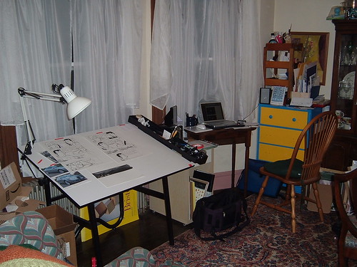
My studio, wedged between the china cabinet & a recliner.

Comics: Catfight, Pale Fire, Cross Country
Website: mkreed.com
Making comics since year of:stories since roughly 2000, little stuff since I was a kid
Art education/schools attended: attended Syracuse University, but for English, not art, just snuck art classes in where I could

Tools

Pencils: I use mechanical pencils, usually .07 lead of various brands & types, or 2.0 Steadler HB, and I pretty much always sketch with blue lead. I have a stash.

Inks: P.H. Martin's Black Star Matte. Some P.H. Martin's transparent watercolors for greys, and recently I've been trying tubes of Windsor Newton watercolors for grey tones as well.

Brushes: Raphael 8404, usually #0, for lines. Crappy synthetic nylons for watercolors. (for now, I'm still experimentig, but I don't want to ruin brushes that cost $10+ when I don't know what the difference is. Once I get used to painting with watercolors, I'll upgrade.

Pens: Faber Castell Pitt pens, for lettering, and sometimes in lieu of brushes. I have a Pentel Japanese brush pen that puts down very lovely lines, but I have yet to use it for anything beyond sketching. I've also tried the G nibs & have been considering makeing more regular use of them.

Paper: Strathmore 300 plate, and my usual pages are on 11x 17. For special occasions, I'll upgrade, and go for 400 or 500. (I made this as a wedding present and I think it was on 500 2 ply.)

Lettering: Faber Castell Pitt Medium/Fine pen. Usually without a guide.

Color: I don't often use color. It's nerve wracking when I do. I've used Photoshop, and I've used Gouache. I prefer doing it by hand where I can.

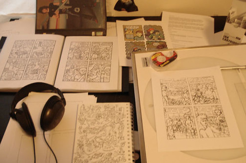
Layout/ Composition: I write everything in my sketchbook & do the layout as I write. Usually by the time I've writen something down, I've thought about it for so long that I don't do many revisions.

Convention Sketches (when different from illustrations done in the studio): Depends on what I have in the lunchbox. My favorite writing pen is the super thin Uniball Vision Elite with Blue/Black ink. (That's not Blue or Black. They make a Blue/Black. It's gorgous.) I almost always have it on me and it's usually the first thing I grab, if not it's probably a Pitt brush pen. I sometimes pencil, and sometimes don't. For regular notebook sketching, I use a Pentel mechanical .07 pencil & non-photo blue lead, because it smudges much less.

Tool timeline, starting from when you began drawing in any serious way until the present, and what spurred the changes: Oh boy, this is a lot of asking questions & self discovery, as I didn't have much formal art training aside from high school, where I mostly spent time in the photo lab... In high school, the notes I wrote to my friends were comics in pencil & pen on notebook or computer paper, but when I first started making stories, I used black colored pencil. Amazingly, these scanned, but didn't look super hot. I started combining Microns, and then started using a Hunt-Speedball nib & Bienfang bristol. (This was what was in the basement art supply section at Syracuse. I used Higgins Black Magic for years, not realising there were vastly superior inks to be had. I switched to brushes & continued, as the line was much nicer, ever though I used crappy synthetic "white sable" brushes. This continued until I finished my first book, Catfight, and is part of why it looks so crappy. Oh! I started the book on Bienfang bristol, but moved home & only found Strathmore in the right size. (Or Strathmore was cheaper, I forget exactly.) By the time I finished the book a year later, the Bienfang paper was noticably more yellow than the Strathmore. Now I try to store pages in the dark so light won't affect them.
At some point before I began my next book, I started asking other people about what they used to make comics. I read the Cerebus Guide to Self Publishing, but disregarded Dave Sims' advice on brushes, because from using the brush enough, I though he was full of BS on the thing about the nibs. You can get around stuff with practice, or at least get to the point that you know your brushes well enough that you get a sense when you need to do things to avoid split hairs & such. They just take more attention & care. Anyhow, among other indie comics alumni Jim Rugg gave me some advice on inks. I tried out a whole bunch, and decided to stick with P.H. Martin's Black Star Matte. I tried using W&N's Series 7, but then my boyfriend's buddy Farel Dalrymple told me about the Raphael 8404 brushes, which I could tell when I touched the bristle were made from much nicer stuff. Todd Webb is actually sponsored by Faber Castell, as he only uses the Pitt brush pens, and will let anyone try one.
For my new book, I started out inking with Pitt pens, but it doesn't have the same feel as brushes, and while I can do pages faster with them, I hate using them. Just not as fun on a whole page. I've been using watercolors over them for grey tones, and I've been liking how they look much more. (The home page of my website has an example.)
Then I started this blog, and since then, I've tried using the G-nibs, which I like, but not more than brushes. And I've used the Pentel Japense Brush Pen, which is the nicest brush pen I've tried yet. I've also been trying out watercolor paper, but have no opinions yet.

What tools you'd never use, and why: Microns & Sharpies bleed too much. Adobe Illustrator sucks the fun out of everything. My Wacom tablet, it's just my mouse. That's all I've used it for in like three years. Speedball nibs I think will eventually drive anyone insane. Higgins ink when I want solid blacks.

And lastly, any advice you'd like to give: Don't go out and buy a $20 brush when you don't know what a $2 brush is like. Buy the cheap stuff and upgrade when you've gotten better with them. Then when you get a better brush, you'll know what the difference is & won't kill some expensive stuff with your crappy beginnings & lack of care.
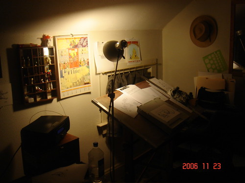
Give yourself a nice setup to work in. It makes it much easier to stay at your desk when you have a place for your tea, an audiobook loaded up on your stereo, and a stack of bristol right next to you. Also it gives you fewer excuses to get up.
Listen to audiobooks, especially long books that would otherwise take you a while to read. Music is too easy to get up from, but good stories are harder to take a break from.
Set a realistic schedule & stick to it, but don't let yourself get burnt out. Take breaks when you need to, but don't get lazy.
Be a shameless self promoter.

AP #8 on sale ON-LINE !


That's right, kids, the SENSELESS VIOLENCE SPECTACULAR, starring Kant, Hegel, Schopenhauer and "You're A Good Man John Stuart Mill" (which you can read in its entirety below) is now on sale right here at the Action Philosophers on-line store. So make with clicky and order your asses off!!
I've been trying to post more or less weekly as of late, but we'll see how this goes. In the meantime, since today's my birthday, I posted my own answers to the survey.
-MK

Exclusive AP #8 Preview at COMIC BOOK RESOURCES!


AP #8: SENSELESS VIOLENCE SPECTACULAR doesn't go on sale until a week from now at the New York Comic Con (see the next news story below), but thanks to our pals at Comic Book Resources, you can read one of the stories, "You're A Good Man, John Stuart Mill", for free on-line right now! SO MAKE WITH THE CLICKY ALREADY!!!
Karl Christian Krumpholz


Comics: Currently working on "Byron: Die, Byron! Die" which is the follow up series to "Byron: Mad, Bad, and Dangerous" (currently being published by Slave Labor.com. Can be purchased at: http://www.slgcomic.com// and http://www.eyemelt.com/.) I have also done other comics: "Angst Boy Comics", "Sturm und Drang", and "Shadenfreude".
Website: The easiest place to reach me is my MySpace page. It's got art. There is also my LiveJournal page where I bitch alot about things.
Making comics since year of: I think I started doing Angst Boy about 1998.
Art education/schools attended: None really. Took some art classes at Temple's Tyler school of Art in Philly, but most of my actual comic art was self taught. From working at a comic shop, I knew quite a few other professional cartoonists in Philly who offered me a lot of criticism advice. I also worked at an art supply store for a time, which helped me learn about some of the tools.

Tools

Okay, I create my comics in a weird sort of way. Probably a lot different then most others. I pencil all of my art on one page, using blue lines and lead, and ink the art on a whole other page, using a lightbox to guide me. So, in the end, I have two pages of artwork. I also use my Mac quite a bit. I use Adobe Photoshop to clean up the page and straighten lines. I then convert the art work to an Illustrator document using Adobe Streamline. I letter and place the doc in printer spreads using Adobe Illustrator.


Pencils: I use Stanford Turquoise 02022 Lead Holders rather then actual pencils. I just like the feel of them as well as the sharpener. As actual lead, I use blue lead (doesn't matter what kind: Staedtler or Stanford non-photo blue) for the start of the page before I use HB lead (again: Staedtler or Stanford) to tighten the sketches up.

Inks: I used Winsor & Newton Black India ink for a while. However, I didn't like the kind of varnish they apparently use in it (makes the black look shiny.) I wound up using (and still use) simple Black Sumi Ink. I pick up one of the big green canisters and it lasts me quite a long time.

Brushes: For inking, I use crowquils and brushes. It took me a little while to get use to the crowquils, but love them now. I use the Hunt #107 crowquil point, but will also use a #102 if I can't find a #107. Just love the sharp line that it can create. For brushes, I generally use a size 6 Round brush, though it really doesn't matter what brand. My current brand is Princeton Art & Brush Co.

Pens: I don't use pens any more. I used to use a Koh-I-Noor rapidograph for a long time (cause I worked at an art supply store and could get them at a discount.) However, they were always a pain in the ass with clogging, clean, and they always left me dissatisfied. They are simple to use, but the lines have no wait. So, I have a large stock of them now that I never use.

Paper:I love the 14" x 17" Strathmore 500 Series bristol since it just sucks the ink right up. I also lean now towards Plate bristol rather then the Vellum. I used Vellum bristol for a long time, but after accidently picking up a pad of Plate, I got hooked on the smoothness of the paper. The crowquil just glides over it. Brilliant.

However, since moving to Denver, I haven't been able to find any Strathmore paper at any of the art supply stores (we have only two here in the center of the city.) So, I have been using whatever bristol I can get, mostly Bienfang for my inks. I also use a cheaper bristol for my penciled pages. I could simply use drawing paper (and have in the past), but I like the weight of the bristol.

Lettering/Color: For both lettering/color, I use the Illustrator CS computer program. All of my actual comic pages are b/w, so the only coloring I do is for my covers.

Layout/ Composition:I do my thumbnails on a simple legal pad. I do them quickly and throw them away.

Convention Sketches (when different from illustrations done in the studio): For conventions, I generally use a series of pens. I do the sketch in non-photo blue (it's what I'm most comfortable with) and then do quick inks using a Faber-Castell Black PITT brush pen. Also, if the person asking for the sketch is not annoying and seems appreciative, I will also do a quick color with a Tombo art pen (light blue: #451.) An inked sketch using only one color looks really good.

Tool timeline, starting from when you began drawing in any serious way until the present, and what spurred the changes: I think I pretty much answered most of this above. When I first started with Angst Boy, I used those Comic-Pro blueline comic pages and a series of pens. I then moved to bristol board and rapidographs. I slowly moved away from tech pens and started using crowquils and brushs.

What tools you'd never use, and why: Those Comic-Pro blueline pages and rapidographs. Never again. I've already explains the reasons for the rapidographs. I don't like the blueline pages simply cause I don't see a reason for them. I mean, you can get better blank bristol board cheaper. With the Comic-Pro pages, you are only paying for the easy of the printed guides on the page. You can easily measure them out yourself.

And lastly, any advice you'd like to give: Well, the complaint I hear the most from other artists that are just starting out (and I was guilty of this as well for a time) is that they get stuck on one page. They aren't happy with their results, so they obsess and redraw their comic over and over again. My view is to get over it. Move on. You will improve. It's more important to finish the work and get it out there then to fret on it's not perfect. It will never be. I cringe looking at my earlier work. Even the stuff being published now.

Fred & Ryan appearing at NEW YORK COMIC CON!


Action Philosophers' creators will be making our second annual appearance at the second annual NEW YORK COMIC CON from February 23 to 25, 2007. Come say howdy at table A243 upstairs in Artist's Alley, and they'll be more than happy to sign your brand-spankin' new copy of ACTION PHILOSOPHERS #8: SENSELESS VIOLENCE SPECTACULAR which goes on sale for the very first time at NYCC!
Tim Winstead

Comics: 'Stoopid Stuff', ' Delusionz,' 'Now that's a First,' and  ' Whatever ' !  ( all single panel cartoons )
Website: http://www.komikstripkartoonzbytimwinstead.com
Making comics since year of: Birth..no,..seriously ..I've been drawing all of my life, whether it be considered doodles of some sort or not, I've had an affinity for drawing for as long as I can remember. Only about 10 years ago did I really try and commit to improving my skills and put my art out there.
Art education/schools attended: I took a 'at home' Master Art ' course thru a school called ICS (International Correspondence Schools ) out of PA. back in the 90's. Aside from that, everything I know or do is self-taught.

 
Tools:

 In as far as tools go..I don't play favorites. I like to experiment with different tools and see what the use of them can offer. As for what I'm using now..I'm trying my hand at using Faber-Castelle Pitt  Pens which are easy to use so far and I like the results I get from them.

Paper:even though I treat myself once in a while by getting an actual sketch pad..I use plain old printer paper. I pre-print up mass copies of my panels' 'workable size @ 7 " x 7 " . This size is indicative of each feature I work on allowing of course for  the title,and captions.

Brushes:don't use any..at least not for my cartoons. IF and when I make a mural, then I'll use whatever brushes I can find. I'm not into chasing down premier brushes or any other type of ' equipment '.

Lettering: Usually only done by hand if the 'toon calls for it or again, if a mural is in the works..then ALL lettering is done by hand.

Color: Although I can color by hand, it's more of a benefit to me to do it via p.c.

Layout / composition: no set standard here either. again, my toons are dependent on how well the gag is written. From ' A'  where the gag is penned..to ' B ' ' tweaking ' the rough...to ' C ' ' fine-lining ' the final pencil. Then, shading indicators are made. After that..  the inking begins and finally, any pencils that remain are erased .

The toon is then scanner-bound and imported to my arcaheic version of PS 6.0 where final touches such as color and text are done. In the end, a file is saved..hard copy printed..and toon is finally published on my site.

Convention Sketches : Never done any.

Tools I'd never use: crayons..lol...actually the only tool I'm not into is the ' tablet'. Sorry, it's that 'old school ' in me, but paper has to be the primary media..no ifs ands or buts.

Advice:  hmmm...not really. A person will only cull from advice given if it meets with goals or weaknesses that one is concerned about. I just always try to remember why it is that I strive to be a professional cartoonist and what it is that appeals to me about the craft. If money comes before anything else and your only goal is fame..you are bound to be bound by the whims of others who may have little concern for you as an artist and more as one who will serve their interests alone. If, on the other hand, you remain true to the craft itself..the ethics of this special community...and the joy you bring others who see your work as that of someone who truly loves what he or she does........there can really be no better fortune than that.

Sounds a bit corny, I know........but that's how I roll.


AMERICAN LIBRARY ASSOCIATION (ALA) NAMES ACTION PHILOSOPHERS A "GREAT GRAPHIC NOVEL FOR TEENS 2007"

yalsaThe Young Adult Library Services Association (YALSA), the fastest growing division of the American Library Association (ALA), has announced its 2007 recommended list of Great Graphic Novels for Teens. Among the winners is Evil Twin Comics' Action Philosophers Giant-Size Thing vol 1. The books on the list meet the criteria of both good quality literature and reading appeal for teens.

VOTE for AP to win an EAGLE AWARD!

Eagle award
The fine folks who run the Eagle Awards, Britain's highest comics honors, have nominated Action Philosophers Giant-Size Thing Vol. 1 to be nominated for an award in the "Favourite Reprint Compilation" category.

Yes, I know, British people can't spell worth a damn. But their accents are so adorable aren't they? And wouldn't you want them to honor Action Philosophers. I know I would. So please go to the Eagle Awards 2006 web site and vote for us to be nominated. I did!
Jenny Gonzalez


Comics:Too Negative
Website: http://www.jennydevildoll.com
Making comics since year of: 1995
Art education/schools attended: Parson's School of Design

Tools

Pencils: Usually just the mechanical pencils I get at the 99 cent store--this is a pretty lo-fi operation here!

Inks: The Japanese brush pen I use comes with it's own cartridges of ink.

Brushes: none

Pens: I have an assortment of pens mostly from Kinokuniya, this Japanese bookstore in Rockefeller Plaza. Ironically, the main one I use is manufactured by an American company, Pentel, but only distributed in Japan, so they have to import them! Another one I have has the Mitsubishi logo on it, like the car. I like the brush pens because of the variety of line you can get with them. I also have a fine tipped mechanical pen for doing background stuff where I don't want the line to be as strong. Oh, and I also use the plain old Pilot Precise V, available at any drugstore for lettering and Sharpies for filling in large black areas.

Paper: I like to use Vellum paper even though it's a little more expensive. Though I've also been known to draw full comix on the back of junk faxes we get at work.

Lettering: It's all hand lettering

Color: When I do color strips for my online site I do it on Photoshop. Otherwise most of my stuff appears in black and white.

Layout/ Composition: I don't really think about it as much as I should, unfortunately. I just get so caught up in doing the drawings and moving the story along that most of my composition is very basic.

Convention Sketches (when different from illustrations done in the studio): I'm usually way too wired at conventions to sit and sketch. :) But if I did I'd probably use the same tools.

Tool timeline, starting from when you began drawing in any serious way until the present, and what spurred the changes: I've experimented with rapidographs, crowquills, and assorted calligraphy and brush pens trying to get a line I really like. So far the Japanese Pentel pen does it!

What tools you'd never use, and why: The Sakura brush pen. It's felt and the point gets blunt really quickly, so you can only get fine lines with it when it's brand new.

And lastly, any advice you'd like to give: The world needs more beautiful drawing.
Sorry for the long absence. I had a project that was devouring my time, but it's nearly done now, so I'm slowly beginning the blog again. No interviews for the moment, ideally I'll be back into them by next week, but here's a few links:

-There's a discusion going on at Make Comics Forever about lettering techniques that y'all might find interesting.

-Matt Bernier keeps a blog in which he talks about things relating to his comics, including some comments on paper. He also sent me this email after I posted about the T-3 nibs:

If you go here: http://mattious.deviantart.com/gallery/, every single thing not inked with a brush was inked with the T-3 nib. (Except panel borders and lettering.) Literally everything. And most of it with the same one, which I still have in my pen holder.
-Matt

So check those out!

-Shannon Wheeler sent me some pics of his studio & study awhile back which I had neglected to put up til now: